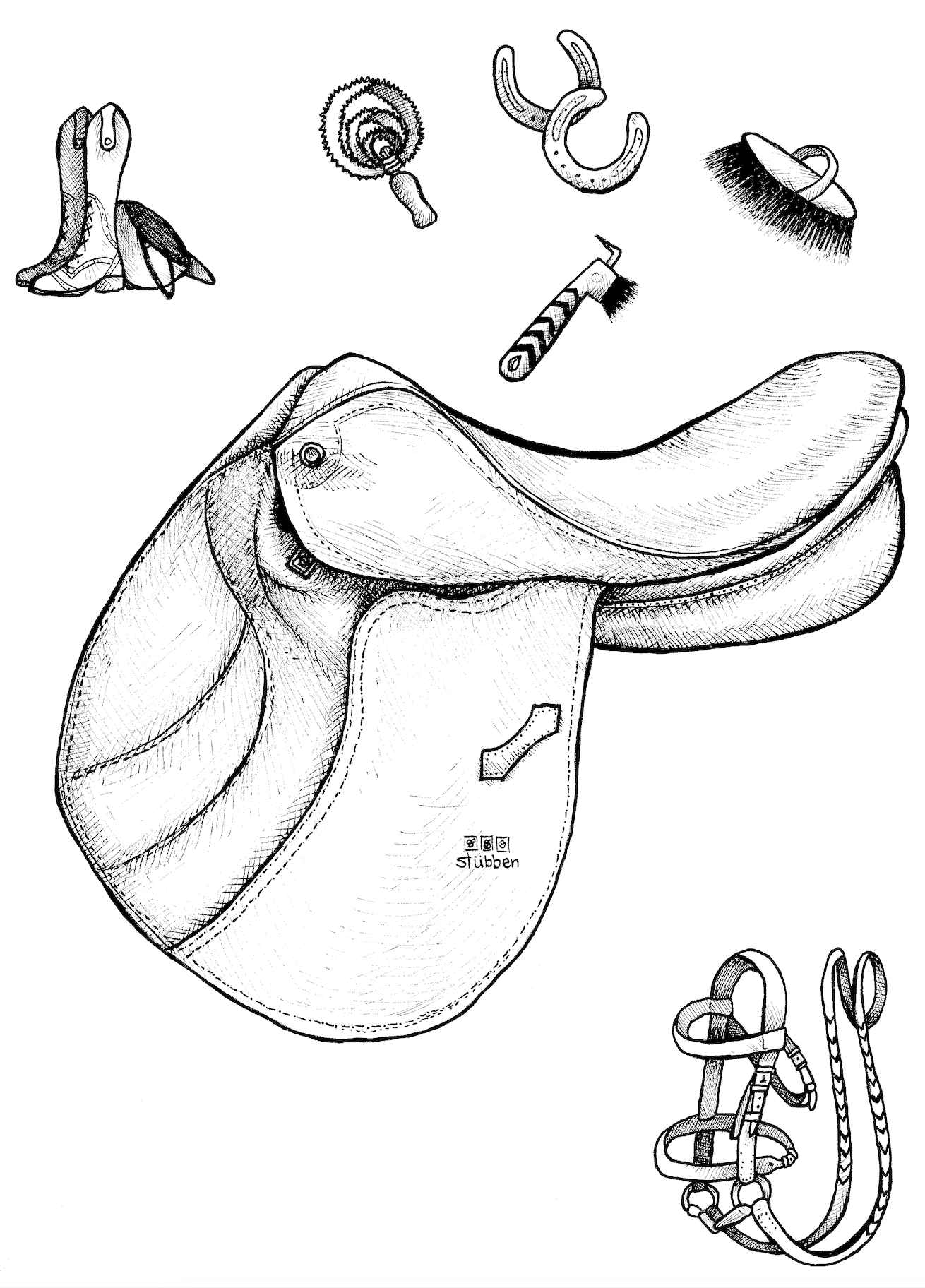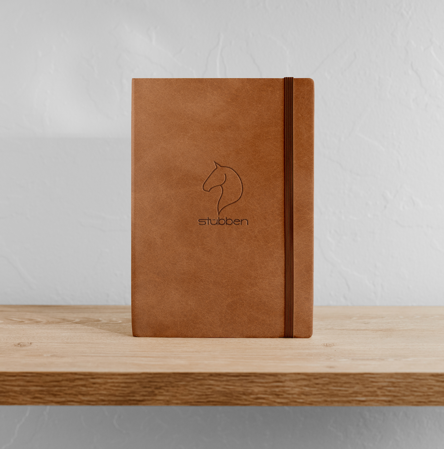
In this assignment, I had to make a brand book for a chosen company. I chose Stubben, an English saddle and tack company, partially because of my own love of horseback riding. For the cover, I chose to make it leather-bound, with their current logo and a hand-drawn horse debossed into the leather. The detailed illustrations were hand-drawn with ink in a style that emphasizes the hand-made products of the brand. I decided to draw them similar to a woodcut to give them a timeless but classic feel.
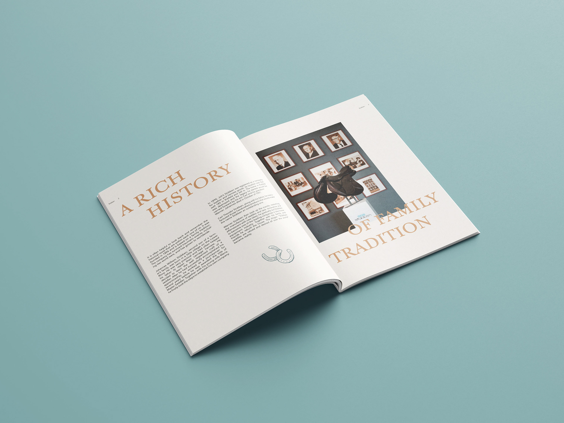
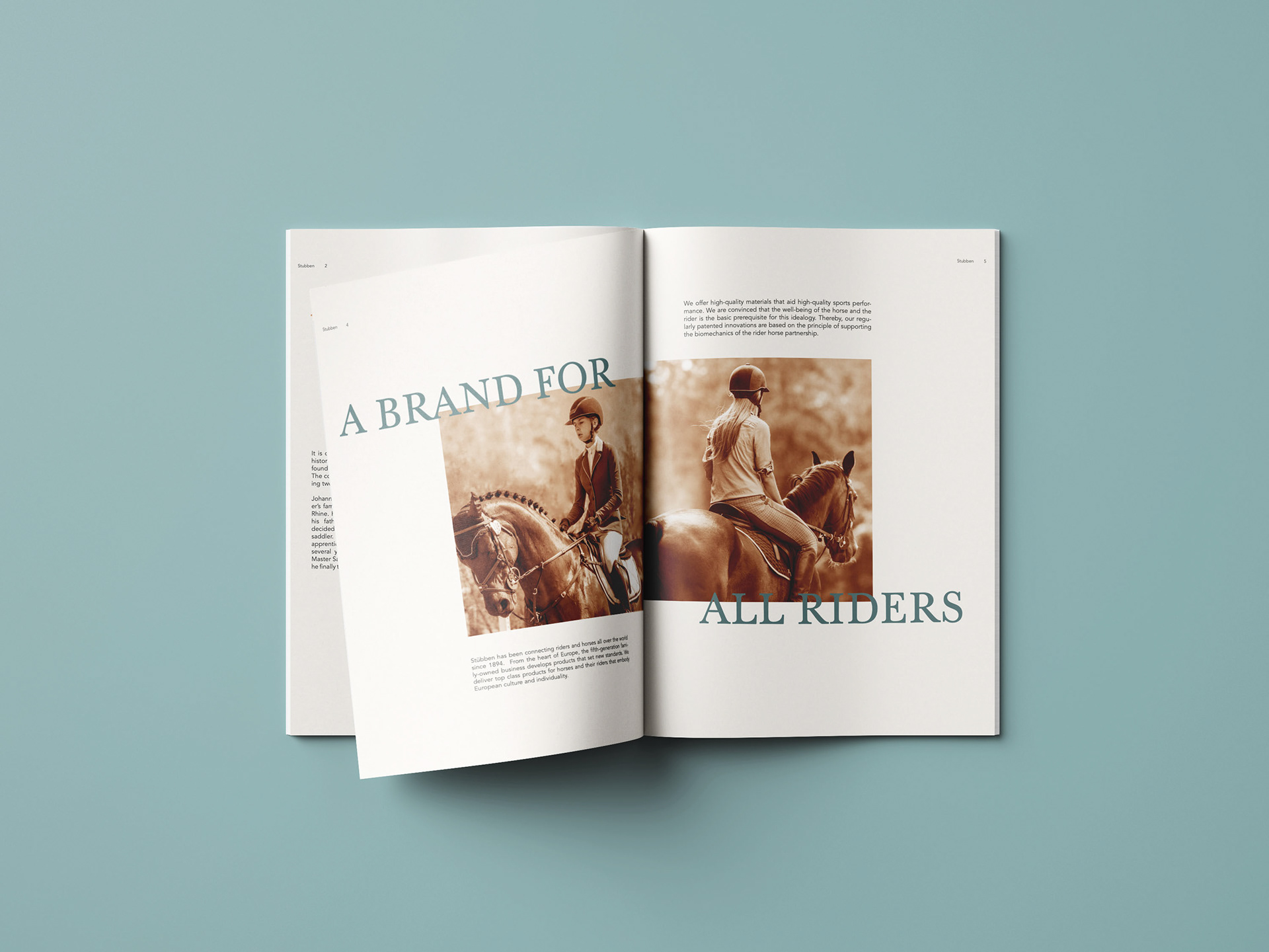
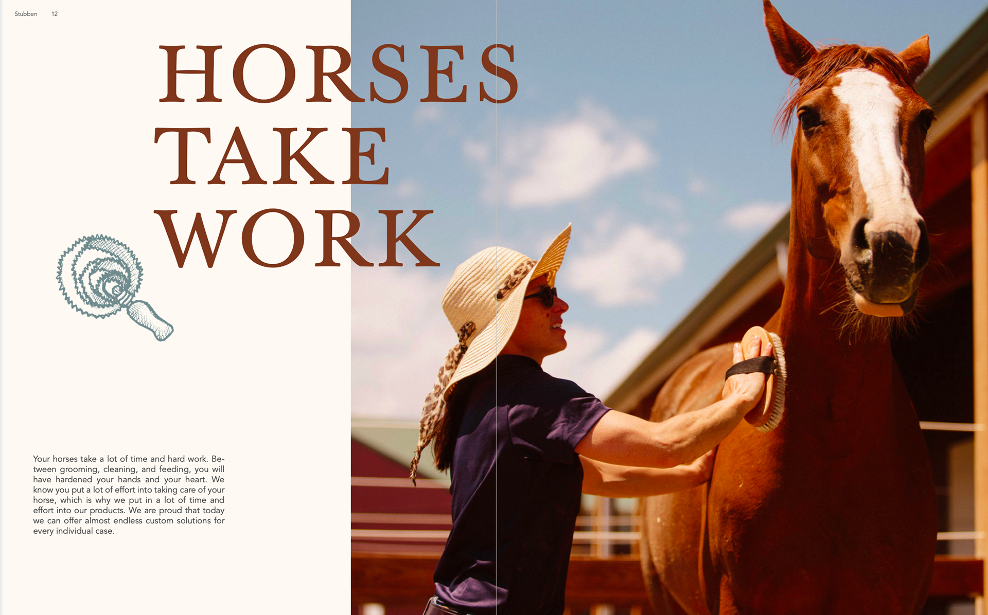
These first pages delve into the brand’s history, emphasizing the family-owned aspect. Though the whole book’s purpose was to expand the brand’s audience from upper-class riders to all riders, this second spread, in particular, played on that idea.
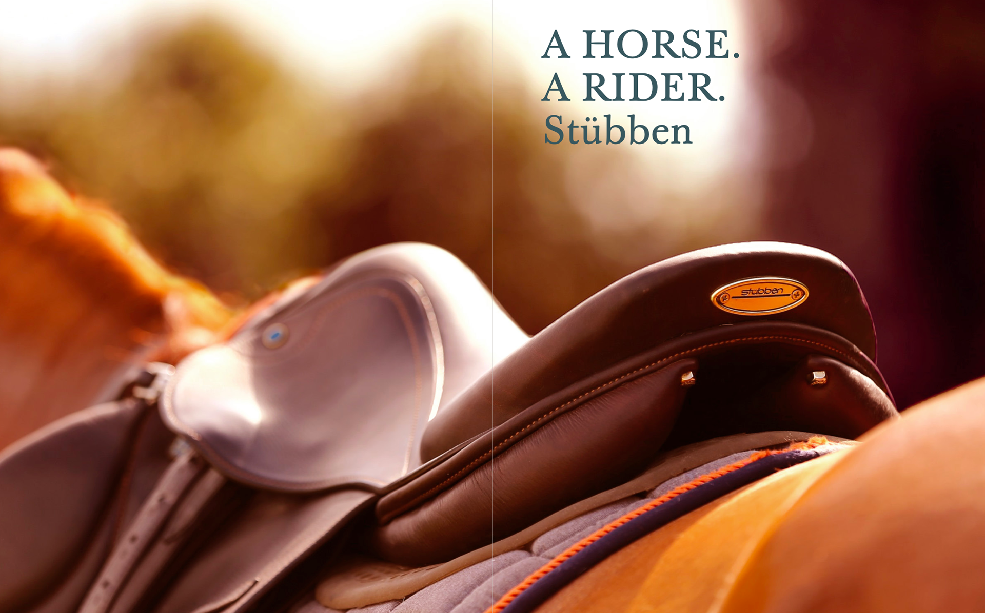
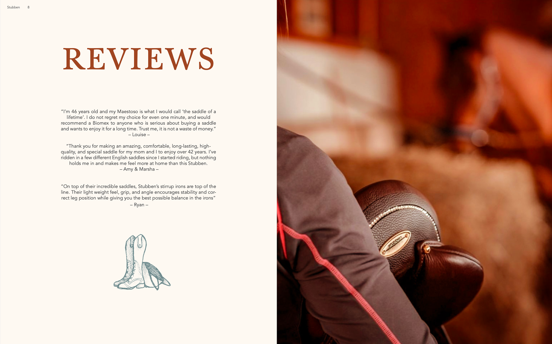
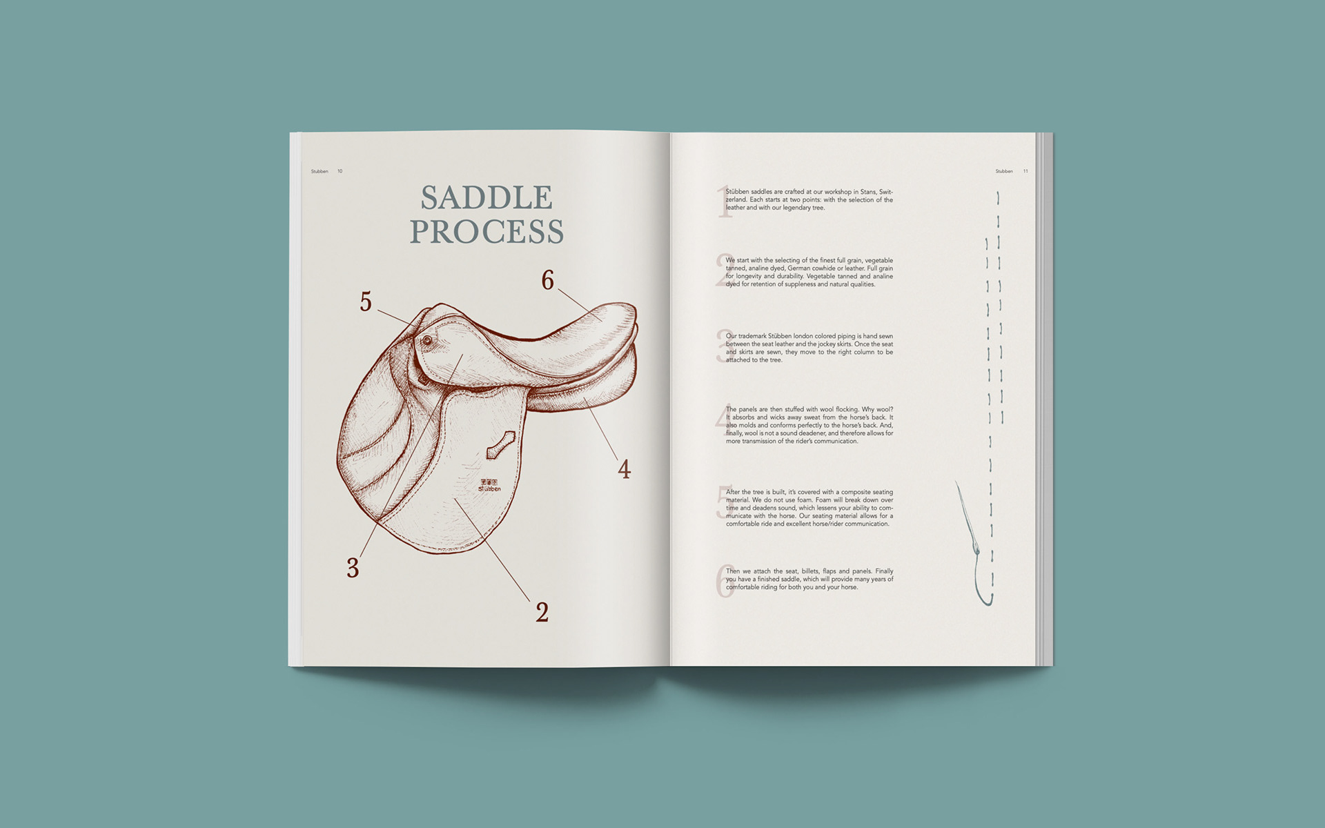
The third spread shows a beautiful full-bleed image to really show the detail on their saddle and to show off their tagline. By including the reviews on the fourth spread, it adds a personal connection between the brand and its consumers. This fifth spread was especially fun to make, which exhibits my illustration of one of their saddles, and a spot illustration on the right page. These pages delve into their hand-made saddle-making process.
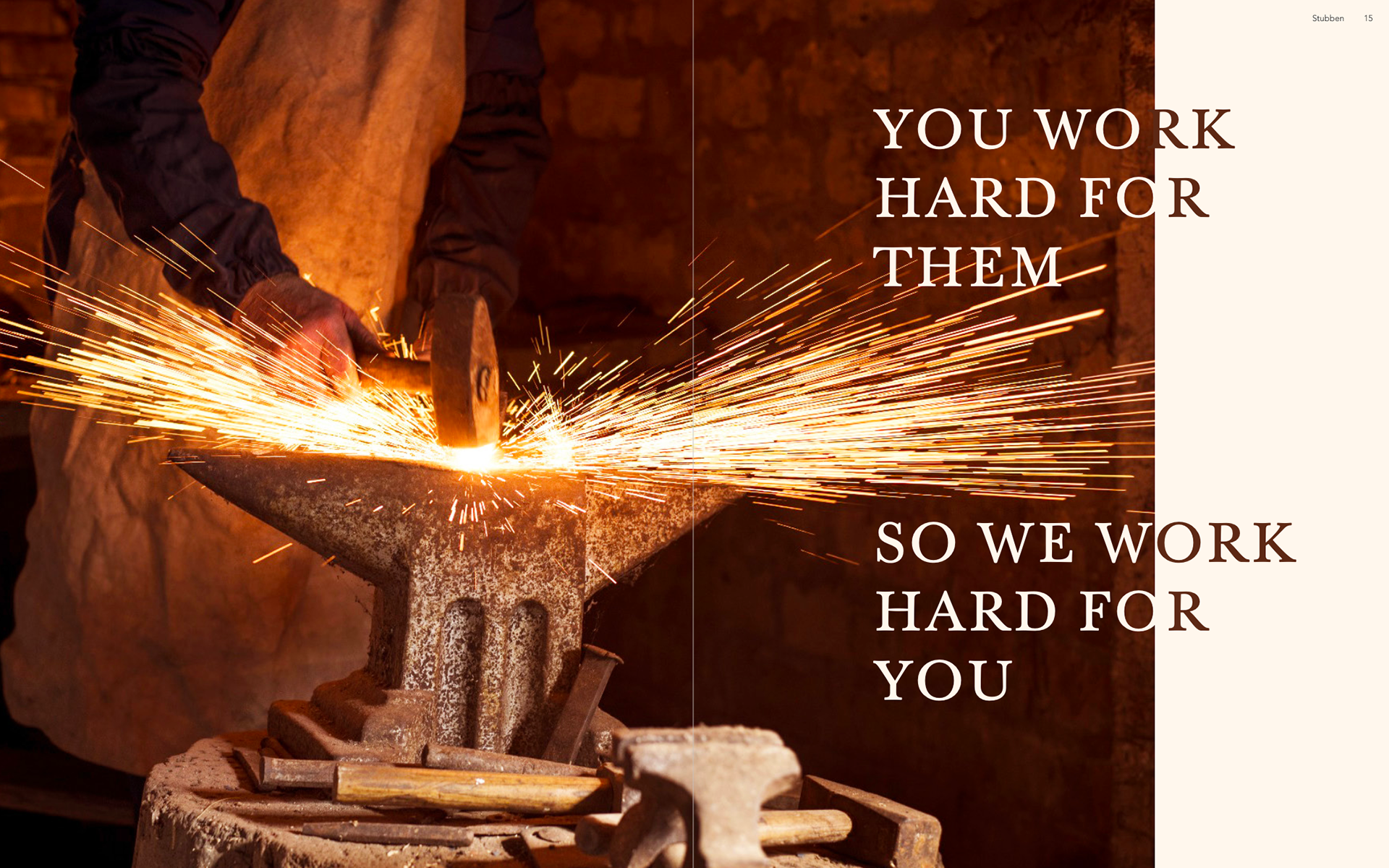
The last two spreads tie together, both with themes of working hard. These spreads show that the brand understands that taking care of horses is very hard work, so they should work just as hard for you.